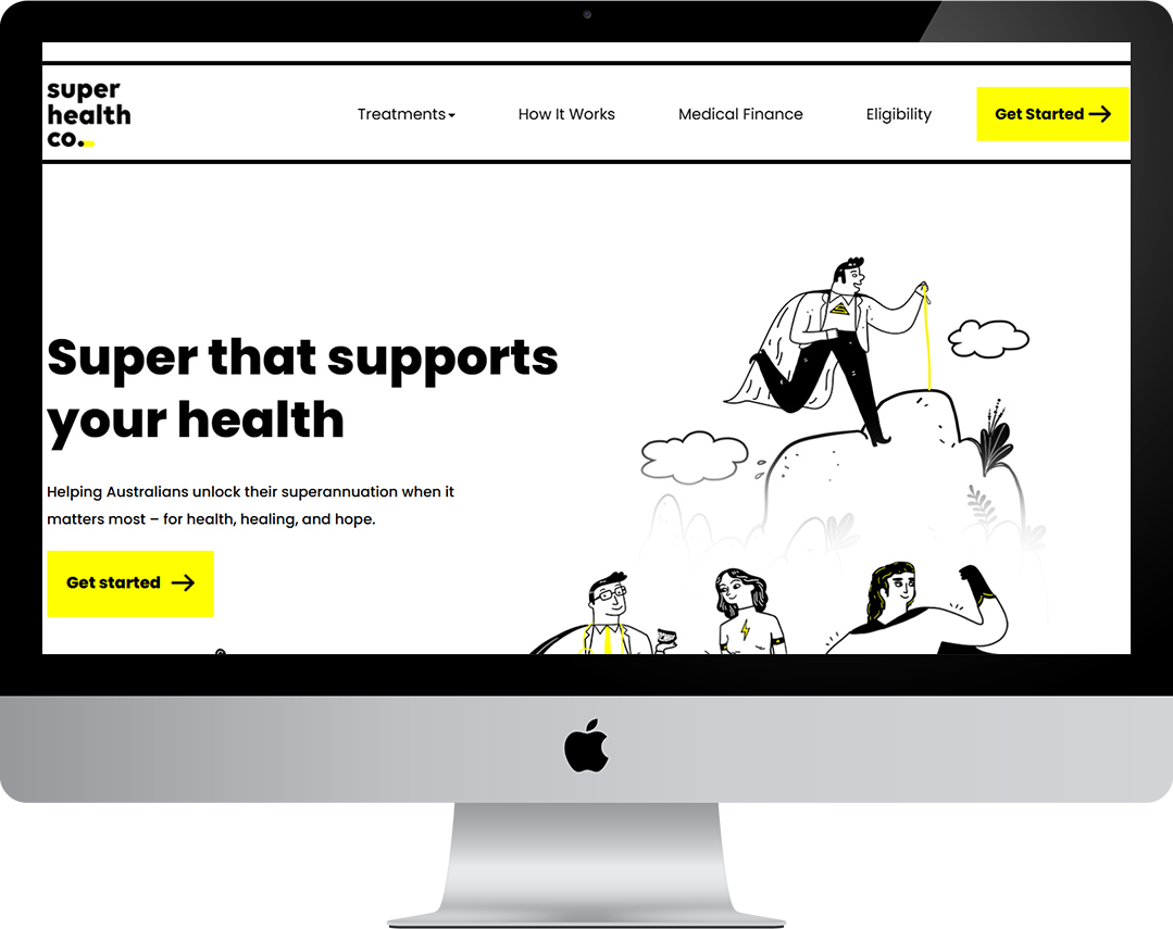
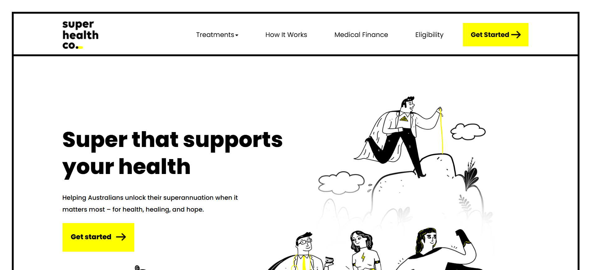
Super Health Co offers Australians access to early superannuation release for urgent medical treatments — from dental work and IVF to addiction rehab and mental health services. The client approached us to streamline the website’s communication, improve mobile usability, and modernize the platform’s visual identity to inspire trust while keeping the message simple and direct.
We focused on clear calls to action, bold iconography, and emotionally sensitive language to reflect the urgency and compassion behind the service.
Preliminary Design or Layouts
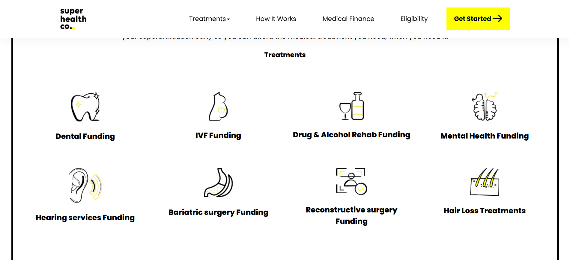
We restructured the site using a modular layout with a centralized treatment section that breaks down funding options visually. Custom-designed icons and minimalist color treatments create a clean, welcoming interface. Typography was chosen for clarity, especially for mobile users scanning under stress. Our focus was on hierarchy and flow — making it easy to find help fast.
The Challenge
We had to turn a government-heavy and often emotionally charged process into a stress-free, easy-to-navigate experience. Every detail — from the homepage message to the funding icons — needed to provide reassurance while encouraging action. Accessibility, speed, and empathy had to be balanced across all touchpoints.
What We’ve Done
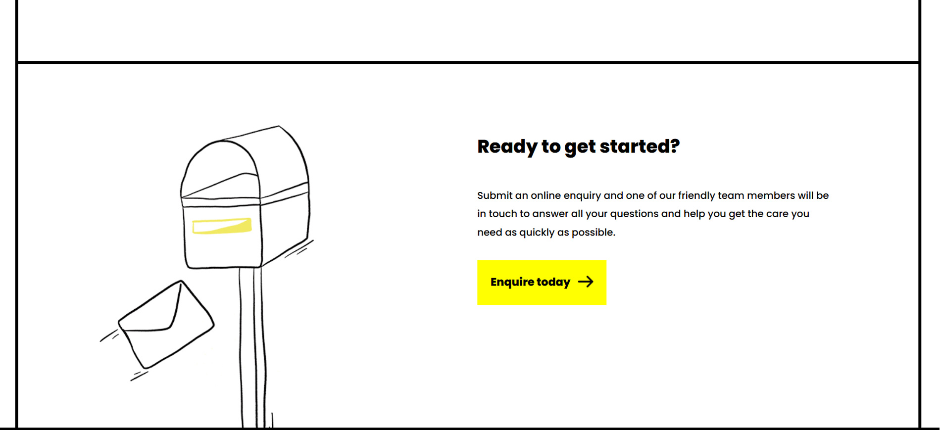
We rebuilt the user journey with clarity, warmth, and strategic simplicity. Each service page now guides users with structured sections, FAQs, and easy eligibility info.
In the first 4 weeks post-launch, bounce rates dropped by 34%, and average session times increased by over 50%. The new site helped drive more qualified form submissions by offering a clearer path to funding, especially on mobile devices.
By aligning user experience with emotional context, Super Health Co is now better positioned to help more Australians access life-changing treatment — exactly when they need it most.


